Few tools in crypto have earned the kind of staying power that the bitcoin rainbow chart has. Over a decade since it first appeared on a Reddit thread, it remains one of the most cited long-term valuation frameworks for Bitcoin - referenced by retail investors and on-chain analysts alike. But using it effectively requires understanding what it actually measures, where it breaks down, and how it fits into a broader analytical toolkit.
This guide covers everything: the chart's mechanics, what each color band signals, how to access the live version, and how experienced traders combine it with quantitative indicators to make more informed cycle-level decisions.
⚡ Key Takeaways
- The bitcoin rainbow chart is a long-term valuation visualization that overlays color-coded bands on Bitcoin's price history using a logarithmic regression model
- Nine color bands span from "extreme undervaluation" (dark blue) to "maximum bubble territory" (dark red), each representing a different phase of market sentiment
- The chart was updated to V2 in November 2022 after BTC briefly broke below the model's lower boundary, making the formula more conservative
- It's a directional context tool, not a price prediction engine - treat it like a weather vane, not a forecast
What Is the Bitcoin Rainbow Chart?
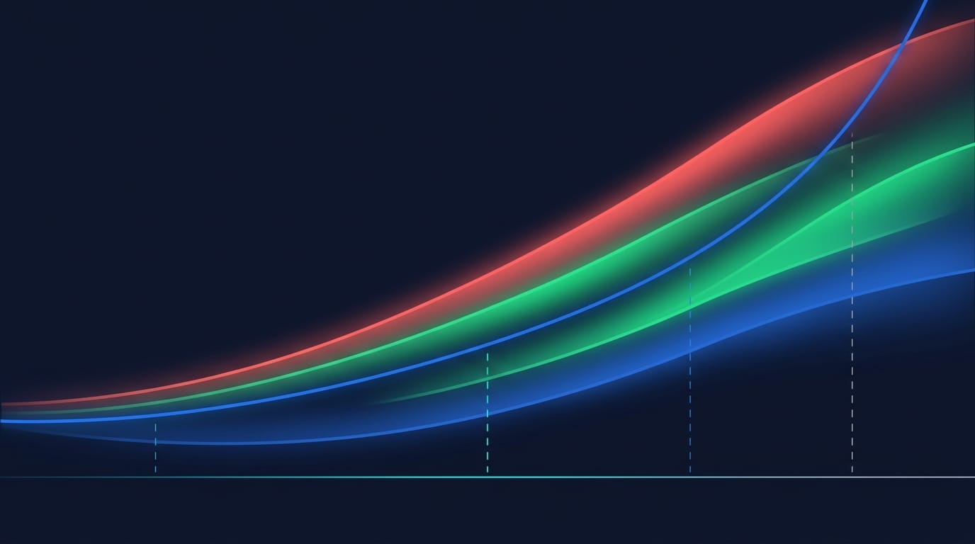
At its core, the bitcoin rainbow chart is a long-term valuation visualization that plots Bitcoin's historical price on a logarithmic scale and overlays a series of color-coded bands around a central regression curve. Those bands divide BTC's price history into nine distinct valuation zones, from deep undervaluation at the bottom to extreme overvaluation at the top.
The logarithmic scale is deliberate and important. Linear charts make early Bitcoin price movements look invisible against current ranges - a move from $100 to $1,000 and a move from $10,000 to $100,000 are mathematically identical in percentage terms, but a linear chart wouldn't show it. Log scale corrects that, giving equal visual weight to proportional moves across the entire price history.
History and Origins of the Bitcoin Rainbow Chart
The chart's origin is a three-act story worth knowing if you want to understand why it works the way it does.
In 2014, a Reddit user named azop posted a colorful chart titled "Actual Bitcoin Price vs. Trendline Deviance" during Bitcoin's bear market following the 2013 bull run. It was built as a visual meme as much as an analytical tool - straight-line colored bands slapped onto a log chart to show that BTC was sitting in "very undervalued" territory. No sophisticated formula. Pure pattern recognition.
That same year, a BitcoinTalk user named Trolololo introduced something more rigorous: a logarithmic regression line that mathematically modeled Bitcoin's growth curve. This was the analytical backbone the original meme lacked.
The two were eventually combined by developer Rohmeo at BlockchainCenter.net, who formalized the rainbow chart as a proper charting tool. After BTC crashed below $16,000 following the FTX collapse and briefly exited the model's lower boundary for the first time, Rohmeo released Bitcoin Rainbow Chart V2 on November 21, 2022, recalibrating the formula with more conservative long-term growth assumptions. A further adjustment followed in 2023. V2 is now the default at BlockchainCenter.net.
BITCOIN RAINBOW CHART - ORIGIN TIMELINE
2014
Reddit user azop posts the original colorful price chart - a meme-style visualization showing BTC as "very undervalued" during the post-2013 bear market
2014
BitcoinTalk user Trolololo introduces the logarithmic regression model - the mathematical backbone that gave the chart analytical credibility
November 21, 2022
Rohmeo releases Bitcoin Rainbow Chart V2 - recalibrated after BTC fell below the original model's lower boundary for the first time following the FTX collapse
2023
Further recalibration to reflect a maturing market with reduced volatility compared to earlier cycles. V2 remains the default at BlockchainCenter.net

How Logarithmic Regression Powers the Chart
Logarithmic regression fits a curved line through Bitcoin's entire price history, accounting for the diminishing rate of growth as the asset matures. Early Bitcoin halving cycles produced returns well above 1,000%. Recent cycles deliver 200-400%. The log regression curve reflects that deceleration naturally - it bends as the dataset grows, rather than projecting early hyperbolics indefinitely into the future.
The nine color bands sit as evenly spaced channels above and below that regression line. Bitcoin halvings are marked on the x-axis because their supply-side impact has historically correlated with transitions between band territories. Think of the regression line as the "neutral" center of gravity, and the bands as the range of sentiment deviation from that center.
One analogy worth using: it's similar to how seismologists use logarithmic scales to measure earthquake magnitude. A Richter 8 isn't twice as severe as a Richter 4 - it's orders of magnitude more powerful. Log scale captures that proportional reality. The rainbow chart applies the same logic to Bitcoin's price history.
The 9 Color Bands of the Bitcoin Rainbow Chart Explained
Cool colors at the bottom mean undervaluation and potential accumulation territory. Warm colors at the top signal overvaluation and distribution territory. Here's the complete breakdown:
The yellow "HODL!" band is worth flagging. It represents fair value - the zone where the chart offers the least directional conviction. When BTC sits in yellow, neither an obvious buying thesis nor an obvious exit signal emerges from the rainbow model alone. That's exactly when supplementary indicators (RSI, MACD, Moving Averages) matter most.
Rainbow Chart V1 vs. V2 - What Changed and Why It Matters
V1 and V2 are not interchangeable. Understanding the difference tells you something important about the chart's reliability.
The key practical implication: V1 would have told you BTC was in "still cheap" territory during periods when V2 showed "HODL" or even "is this a bubble?" territory. V2 is the more conservative, more credible model for current market conditions. Both versions remain accessible at BlockchainCenter.net - toggle between them to understand the model's sensitivity.
How to Access and Read the Bitcoin Rainbow Chart
The bitcoin rainbow chart is entirely free to access - no account or registration required. Here's the exact process:
- Navigate to BlockchainCenter.net - go directly to the Bitcoin Rainbow Chart section
- Select V1 or V2 - use the toggle at the top. V2 is recommended as the default
- Hover your cursor over the current price line - the chart displays which color band BTC's price currently occupies
- Note the halving markers on the x-axis - vertical dashed lines showing where each halving event occurred relative to band progression
Bitcoin halving events are visible directly on the chart's x-axis. Their significance isn't decorative - halvings have historically corresponded with transitions from lower (cooler) bands into higher (warmer) bands over the 12-24 months following each event. That historical pattern informs how cycle-aware traders interpret the chart's current reading.
Once you've located the current band, the real skill is knowing how to act on that information - and that requires layering in additional tools.
How to Use the Bitcoin Rainbow Chart Effectively
The rainbow chart answers one question well: where are we in the long-term valuation cycle? It doesn't answer when exactly to buy, how much to allocate, or whether this cycle will mirror previous ones. Keeping those distinctions sharp is what separates useful application from wishful thinking.
Think of the rainbow chart as the macro backdrop. Short-term technical indicators are the micro execution layer. You need both.
Reading the Chart in Context - Historical Pattern Analysis
The chart's value compounds when you read it historically, not just at the current snapshot. Three macro cycles offer a consistent pattern worth studying.
In the 2020-2021 cycle: BTC was consolidating in the green "Accumulate" band in the months surrounding the May 2020 halving. By November 2021, it had climbed through yellow and orange into red - reaching near "Maximum Bubble Territory" - before collapsing back to dark blue/cyan territory in late 2022. That full cycle progression took approximately 18 months from halving to cycle top.
The 2017 cycle followed a similar arc, moving from blue-green in mid-2016 to dark red in December 2017. Past performance is not indicative of future results - that disclaimer matters here. But observing those historical arc patterns helps calibrate what "mid-cycle" versus "late-cycle" looks like when BTC currently sits in a given band.
Combining the Rainbow Chart with Technical Indicators
Here's where I see most traders either use the rainbow chart well or miss its value entirely. On its own, the chart tells you whether Bitcoin is historically cheap or expensive. Paired with short-to-medium-term technical indicators, it becomes genuinely useful for execution decisions.
RSI above 70 combined with orange or red band territory has historically preceded significant drawdowns. RSI below 30 combined with blue or cyan band territory has historically aligned with multi-year buying opportunities. These aren't rules - they're pattern observations that experienced traders use for conviction, not as mechanical triggers.
Free vs. Premium Bitcoin Rainbow Chart Resources
Not all access points are equal. Here's how the main options compare:
All paid platforms include clear disclaimers that the rainbow chart is not investment advice - that's worth noting, because it means even the platforms charging for this data are transparent about its limitations.
Limitations and Criticisms of the Bitcoin Rainbow Chart
Intellectual honesty about this tool matters. Three limitations deserve direct attention before anyone acts on what the chart shows:
⚠ Three Core Limitations of the Bitcoin Rainbow Chart
- Retrospective bias → the model is fitted to historical data and has been recalibrated multiple times to maintain visual coherence when BTC deviated from the original formula
- No predictive guarantee → a chart that models past behavior cannot mechanically guarantee future band progressions
- Black swan blindness → regulatory shocks, exchange failures, and macro liquidity crises don't appear in logarithmic regression models
Retrospective Bias - Why the Chart Always Looks Right in Hindsight
This is the most significant criticism of the bitcoin rainbow chart, and it deserves a direct answer rather than a footnote.
The regression formula is fitted to all available historical price data, meaning it will always appear to have "worked" looking backward. When BTC crashed below $16,000 in November 2022 following the FTX collapse and briefly exited the model's lower boundary for the first time, the model wasn't abandoned - it was recalibrated into V2. V2 introduced more conservative growth assumptions, which retroactively made the 2022 crash appear to fall within the expected range.
A model adjusted post-hoc fits history better than it predicts the future. That's the epistemological issue.
📊 Key Insight
"Treat the bitcoin rainbow chart like a weather vane, not a weather forecast. It tells you where the wind is blowing right now - not where it will be blowing next month."
This limitation is shared by all regression-based models, not just the rainbow chart. It doesn't disqualify the tool - it defines its appropriate use: directional context, not precise prediction.
Trading Strategies That Use the Bitcoin Rainbow Chart
Understanding what the rainbow chart can't do clarifies exactly where it excels. It's a macro orientation tool - and for traders who think in cycles rather than candles, that orientation is genuinely valuable. For a deeper look at how Bitcoin distribution among long-term holders correlates with cycle position, the on-chain data is worth reviewing alongside the rainbow model.
Popular Strategies - How Different Investor Types Apply the Chart
HODL and Long-term Holders use the rainbow chart as a conviction check. Blue and cyan bands historically represent moments when Bitcoin has been deeply discounted relative to its regression trend. De-risking in red territory - not selling everything, but systematically reducing position size - has been a consistent approach across the 2013, 2017, and 2021 cycle tops. The chart won't identify the exact top, but it can signal when the macro environment is historically stretched.
Dollar-Cost Averaging (DCA) investors use band position to tilt their regular purchases. A fixed weekly DCA regardless of price is simple, but weighting purchases 2x-3x heavier in green or cyan territory, and reducing to 0.5x in orange territory, is one systematic way to incorporate the chart's signal without trying to time the market precisely.
Swing Traders treat the rainbow chart as a macro frame and execute on RSI/MACD signals within that context. If the macro band is orange (overvalued) and RSI is approaching 75, the thesis for a short position is more compelling than if the band were yellow and RSI were at 55. The rainbow chart doesn't generate the trade signal - it confirms or challenges the trade context.
Cycle Traders track the complete band progression from post-halving accumulation through the full arc to cycle top. None of these are financial recommendations - they're descriptions of how traders have historically applied this tool.
Risk Management Principles When Using the Rainbow Chart
⚠ 5 Risk Rules for Rainbow Chart Users
- Rule 1 → Never use the rainbow chart as the sole basis for a trading or investment decision
- Rule 2 → The chart reflects macro cycle positioning, not short-term risk - BTC can stay in one band for 6-18 months
- Rule 3 → Position sizing should be based on your own risk parameters, not a chart color
- Rule 4 → Black swan events (exchange collapses, regulatory actions) are not modeled by any regression framework
- Rule 5 → The model has been recalibrated twice in the last four years - treat it as a living tool with acknowledged limitations
Crypto trading involves substantial risk of loss. The rainbow chart is an analytical framework - it doesn't reduce that risk. It provides historical context. Whether that context justifies action depends on your personal risk tolerance, time horizon, and overall portfolio strategy.
The Bitcoin Halving and Rainbow Chart Cycles
Halving events are explicitly marked on the rainbow chart's x-axis in V2, and for good reason. The documented correlation between Bitcoin's 4-year halving cycle and band progression is one of the model's most studied patterns.
- Post-halving (months 1-6): BTC has historically consolidated in blue and green bands
- Mid-cycle (months 8-14 post-halving): Price tends to ascend through yellow into orange
- Cycle top (months 18-24 post-halving): All three complete cycles topped out in red or dark red territory before a significant reversal
Correlation is not causation - the halving is a supply reduction event, and market behavior following halvings reflects a complex interaction of supply dynamics, macro liquidity conditions, and investor psychology. The 2024 halving provides the most recent data point. Whether the historical pattern continues is a question the data will answer, not the chart.

Alternatives and Complementary Bitcoin Valuation Models
The Stock-to-Flow model is particularly worth pairing with the rainbow chart because the two measure different dimensions: S2F focuses on Bitcoin's supply scarcity relative to flow, while the rainbow chart models the demand-side sentiment trajectory. Using both gives you a supply narrative and a demand sentiment reading simultaneously.
No single model captures the full picture. Experienced on-chain analysts typically cross-reference 2-3 complementary frameworks before forming high-conviction macro views. Platforms built around on-chain transparency - where all data is verifiable and no single actor controls the narrative - align naturally with this multi-model approach.
Conclusion
The bitcoin rainbow chart has survived over a decade of bull runs, crashes, formula recalibrations, and complete market cycles. That track record doesn't make it a perfect tool - it makes it a well-tested one. For anyone tracking long-term Bitcoin price scenarios, the rainbow chart is a useful anchor among many.
🆕 NEW BITCOIN INVESTORS
Use the rainbow chart as a first-level orientation tool. Understand where BTC sits in its long-term historical context before making any allocation decision.
📈 ACTIVE TRADERS
Pair the chart with RSI, MACD, and Moving Averages. The rainbow chart sets the macro context; indicators answer the tactical timing questions.
🔄 CYCLE INVESTORS
Track halving-to-band progressions as a macro framework. The 4-year cycle pattern has historical precedent - but treat it as a reference, not a schedule.
The chart will continue to evolve alongside Bitcoin. If BTC matures further as a global asset, the growth deceleration baked into V2's regression model may prove prescient. If volatility compresses, the bands may need additional recalibration. That ongoing evolution is a feature, not a bug - it reflects genuine effort to keep the model honest against real data.
Use it honestly. Combine it deliberately. And remember that no chart color tells you what to do with your money.
Crypto trading and investing involves substantial risk of loss. This article is for informational and educational purposes only and does not constitute financial advice. Always conduct your own research before making any trading or investment decision.
Last updated: March 2026.
Frequently Asked Questions
What is the Bitcoin Rainbow Chart and what does it show?
The bitcoin rainbow chart is a long-term valuation visualization that overlays nine color-coded bands on Bitcoin's price history using a logarithmic regression model. Each band represents a different phase of market sentiment, from extreme undervaluation (dark blue) at the bottom to maximum bubble territory (dark red) at the top. The chart is designed to provide directional context about where BTC sits relative to its historical growth trend - not to predict short-term price movements. It's been continuously updated since its 2014 origin and is maintained for free at BlockchainCenter.net.
Who invented the Bitcoin Rainbow Chart?
The chart was created collaboratively over several years. A Reddit user named azop posted the original colorful version in 2014 during a Bitcoin bear market. BitcoinTalk user Trolololo contributed the logarithmic regression model, which gave the chart its mathematical backbone. Developer Rohmeo at BlockchainCenter.net later combined both concepts into the formalized tool used today, releasing the updated V2 on November 21, 2022 after BTC briefly broke below the original model's lower boundary following the FTX collapse. All three contributions were essential - the visual format, the mathematical rigor, and the ongoing maintenance and recalibration.
What do the 9 color bands in the Bitcoin Rainbow Chart mean?
Each of the nine bands represents a distinct valuation zone relative to Bitcoin's long-term regression trend. From bottom to top: dark blue ("Bitcoin is dead?" - extreme undervaluation), cyan ("BUY!" - high undervaluation), green ("Accumulate" - undervalued), light green ("Still Cheap" - slightly undervalued), yellow ("HODL!" - fair value), light orange ("Is this a bubble?" - slightly overvalued), orange ("FOMO intensifies" - overvalued), red ("Sell. Seriously, SELL!" - highly overvalued), and dark red ("Maximum Bubble Territory" - extreme overvaluation). Cooler colors signal historical accumulation territory; warmer colors signal historical distribution territory.
What is the difference between Bitcoin Rainbow Chart V1 and V2?
V1, created in 2014, used an earlier dataset and more optimistic long-term growth assumptions. V2, released on November 21, 2022, was recalibrated after BTC crashed below $16,000 and exited the original model's lower boundary for the first time. V2 uses a more conservative regression formula with lower long-term growth assumptions and tighter band spacing - better reflecting Bitcoin's maturing market structure. Both versions remain accessible at BlockchainCenter.net via a toggle, but V2 is now the default and the more credible model for current analysis.
Where can I access the live Bitcoin Rainbow Chart for free?
The live bitcoin rainbow chart is freely available at BlockchainCenter.net - no account or registration required. Navigate to the Bitcoin Rainbow Chart section, select V1 or V2 using the toggle at the top, and hover your cursor over the current price line to identify which band BTC currently occupies. Bitcoin halving dates are marked directly on the x-axis. The chart updates daily. For users who want the rainbow chart alongside broader on-chain analytics, CoinGlass and Look Into Bitcoin both offer it as part of their free metric suites.
Is the Bitcoin Rainbow Chart accurate?
The chart's accuracy depends entirely on what you mean by "accurate." As a historical visualization, it's highly consistent - the regression model fits Bitcoin's price history well. As a forward-looking tool, it carries a significant caveat: retrospective bias. The formula has been recalibrated twice (2022 and 2023) when actual price behavior deviated from the original model, meaning it always appears accurate in hindsight because it's adjusted to maintain that appearance. For long-term cycle context, it performs well. For timing specific entries and exits, it requires supplementary indicators.
Can the Bitcoin Rainbow Chart be used for altcoins or is it Bitcoin-only?
The bitcoin rainbow chart is Bitcoin-specific. Its logarithmic regression model was built on BTC's full price history dating back to 2010 - a 15+ year dataset that no other cryptocurrency can match. Applying the same methodology to altcoins would require significantly shorter price histories and would produce less statistically reliable models, since altcoins haven't experienced the same number of full market cycles. For altcoin valuation analysis, on-chain metrics like MVRV Ratio and NVT Signal tend to be more appropriate tools, supplemented by standard technical analysis indicators.