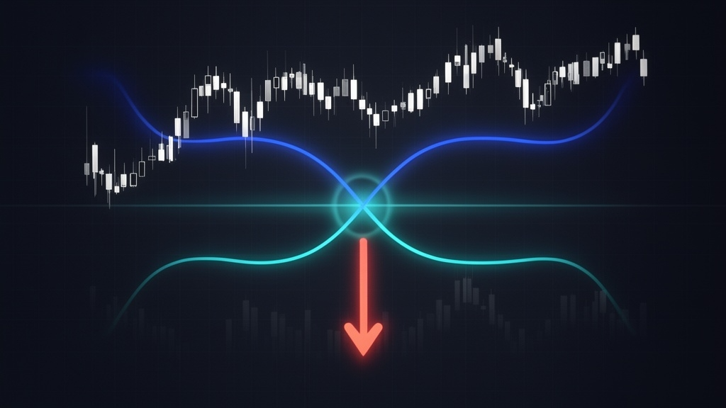
A death cross chart pattern forms when a security's 50-day simple moving average crosses below its 200-day simple moving average - and it's one of the most closely watched signals in technical analysis. Historically linked to some of the worst bear markets of the past century, the death cross chart triggers headlines every time it appears on a major index. But understanding what it actually means - and what it doesn't - is what separates reactive panic from informed strategy.
This guide breaks down everything: what the death cross is, how it forms, how to confirm it with supporting indicators, and how to apply it across stocks, crypto, and other asset classes - without falling for the hype.
⚡ Key Takeaways
- A death cross forms when the 50-day moving average crosses below the 200-day moving average on a price chart
- It is classified as a lagging indicator - both MAs are based on historical price data
- The pattern has preceded major bear markets (1929, 2008, Bitcoin's 2021 collapse) but also generates false signals
- Always confirm a death cross with volume analysis, MACD, and RSI before acting on it
- According to Fundstrat research cited in Barron's, the S&P 500 averaged ~6.3% gains in the 12 months following a death cross - the signal is serious, not catastrophic
What Is a Death Cross Chart? Definition and Core Mechanics
At its most precise: a death cross forms when a security's 50-day simple moving average (SMA) drops below its 200-day SMA, creating an X-shaped intersection on the price chart. The 50-day MA represents short-term price momentum; the 200-day MA reflects the long-term trend. When the faster average falls below the slower one, it signals that short-term momentum has deteriorated significantly relative to the broader trend - a shift the market treats as bearish.
The underlying math is straightforward. A moving average is the rolling arithmetic mean of closing prices over a defined period. For a 10-day MA, you sum the last 10 closing prices and divide by 10. Each new day, you drop the oldest data point and add the new closing price - hence "moving." A 50-day MA applies the same logic across 50 sessions; a 200-day MA across 200. The result is a smooth line that filters out daily noise and reveals the trend's underlying direction.
The death cross applies to virtually any tradable asset - stocks, indices, cryptocurrencies, forex pairs, and commodities. The 50/200 SMA combination is the market standard, though some analysts use 10/50 or 100/200 combinations depending on their timeframe.
The Three Phases of a Death Cross
A death cross doesn't appear out of nowhere. It forms across three sequential phases that every serious trader should recognise:
- Uptrend phase: The 50-day MA trades above the 200-day MA - the classic bullish alignment. Price is generally rising, momentum is positive, and the short-term average reflects recent strength above the long-term baseline.
- Crossover event: Price weakens enough that the 50-day MA begins declining and eventually crosses below the 200-day MA. This is the actual death cross - the moment the two lines intersect and the "X" shape appears on the chart.
- Continuation phase: The downtrend persists after the crossover, with the 50-day MA remaining below the 200-day. This sustained separation confirms the signal. If price rebounds quickly and the 50-day crosses back above the 200-day before the downtrend establishes itself, the original signal is classified as a false signal.
A confirmed death cross requires Phase 3. The crossover alone is not sufficient - it's the sustained continuation of bearish price action that validates the pattern.
Death Cross vs. Golden Cross - Key Differences
The death cross and golden cross are mirror images of the same framework. Where the death cross signals potential bearish conditions, the golden cross - when the 50-day MA crosses above the 200-day - signals a potential bull market phase. Experienced traders use both signals as complementary trend-confirmation tools within a broader technical analysis process.
Simple Moving Average vs. Exponential Moving Average in Death Cross Analysis
The convention for death cross analysis is the SMA - equal weight assigned to every closing price in the lookback window. Some traders prefer the exponential moving average (EMA), which applies progressively greater weight to recent prices, making it more responsive to new developments.
For standard long-term death cross analysis on daily or weekly charts, the 50/200 SMA combination remains the market standard. If you're working on 4-hour or hourly charts where responsiveness matters more, an EMA variant can reduce lag meaningfully.
Historical Track Record - When Has the Death Cross Actually Predicted Bear Markets?
The death cross has one of the more striking historical resumes in technical analysis. Several of the most severe market downturns in the past 100 years were preceded by a death cross on major indices. According to Bloomberg, the S&P 500 had formed the pattern 25 times since 1970 as of March 2022 - and that count has continued growing with the April 2025 formation amid tariff-driven volatility.
The 2008 case is particularly notable. The S&P 500 formed a death cross in December 2007 - just before the global financial crisis accelerated. By the time the dust settled, the index had dropped more than 50% from its peak.
The 2020 COVID case tells a different story. A death cross formed in March 2020, but the ensuing decline was sharp and brief. Markets recovered within weeks. Anyone who shorted on the death cross and held suffered through a significant false signal - one of the more expensive examples of taking the pattern at face value without broader context.
The number that reframes everything: According to Fundstrat research cited in Barron's, the S&P 500 was higher 12 months after a death cross approximately two-thirds of the time, averaging a gain of 6.3% over that span. LPL Financial's chief technical strategist Adam Turnquist found a 72% win rate for the S&P 500 twelve months after a death cross signal since 1950. The death cross matters - it's just not the harbinger of guaranteed collapse that financial headlines often imply.
If you're navigating bear markets in crypto, understanding how to position around downturns goes hand-in-hand with reading signals like this one. The 5 Things to Do in a Crypto Bear Market guide covers the practical side of weathering those conditions.
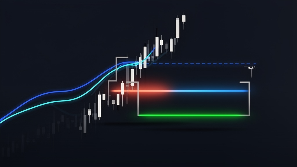
How to Identify a Death Cross Chart - Step-by-Step Setup Guide
Spotting a death cross on a chart takes about two minutes once you know what to add. Here's the setup process using TradingView - the dominant free charting platform for most active traders. The workflow is nearly identical on any platform that supports moving average overlays.
- Open a price chart for your chosen asset. Select the daily timeframe for standard death cross analysis. Weekly charts work for macro-level confirmation; 4H or 1H are viable for shorter-term setups but come with more noise.
- Add the 50-day SMA. In TradingView, click "Indicators" → search "Moving Average" → select "MA (Simple)." Set the period to 50. Change the line color to blue for easy identification.
- Add the 200-day SMA. Repeat the process with a period of 200. Set this line to red or orange. Now you have two MA overlays running across your chart.
- Look for the crossover point. A death cross is present wherever the blue (50-day) line crosses below the red (200-day) line. The visual is an X-shape at the intersection point.
- Check the broader context. Is the crossover accompanied by rising volume? Is there separation between the two MAs (wider gap = stronger bearish signal), or are they nearly touching (possible false signal territory)?
Setting a TradingView alert for the crossover is straightforward: right-click on either MA line → "Add Alert" → set the condition as the 50 SMA crossing below the 200 SMA. This way, you don't need to monitor charts manually.

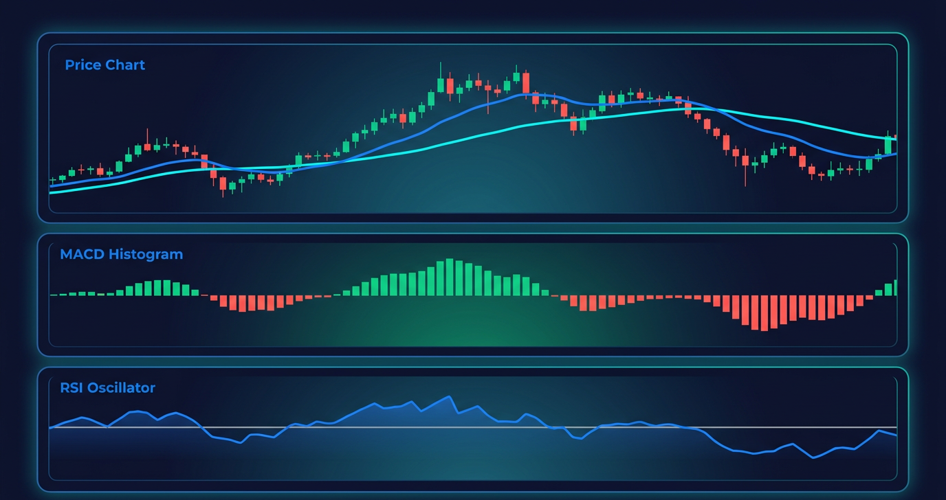
How to Confirm a Death Cross - Supporting Technical Indicators
A death cross alone is insufficient to act on. As a lagging indicator, it confirms a trend that's already forming - which means by the time the signal appears, some of the move has already happened. Confirmation from supporting tools is not optional; it's essential for filtering genuine trend changes from false signals.
Trading volume is the highest-priority confirmation tool. A death cross that forms during a high-volume sell-off is significantly more reliable than one that appears during low-volume sideways drift. Volume confirms that real selling pressure is behind the move - not just statistical lag in the moving averages.
MACD (Moving Average Convergence Divergence) uses its own set of exponential moving averages (12, 26, and 9-period) to assess momentum. When MACD shows a bearish crossover - the MACD line crossing below the signal line - at the same time a death cross forms on the price chart, the two signals reinforce each other. That confluence is a notably stronger bearish case than either signal in isolation.
RSI (Relative Strength Index) measures price momentum on a 0-100 scale. An RSI below 50 at the time of a death cross indicates that momentum has already turned bearish. Conversely, an RSI above 60 when a death cross forms suggests possible divergence - the death cross may be a false signal if underlying momentum is still positive.
📋 Death Cross Confirmation Checklist
- 50-day SMA has crossed below the 200-day SMA (confirmed crossover)
- High trading volume accompanies the crossover
- MACD shows bearish crossover or is below zero
- RSI is below 50 and declining
- Price is trading below both MAs (not just at the crossover level)
- No immediate strong support level directly below current price
Free vs. Paid vs. AI-Based Charting Tools for Death Cross Detection
Not all traders need the same setup. Here's how the toolset breaks down across three tiers:
TradingView's free tier is fully capable of everything covered in this guide - MA overlays, manual alerts, and basic volume analysis. Upgrading to a paid tier primarily adds convenience rather than capability.
Trading Strategies Using the Death Cross Chart Pattern
Knowing a death cross exists is one thing. Knowing what to do about it is another - and the answer depends entirely on your trading style, timeframe, and risk tolerance.
The core trading logic is straightforward: a confirmed death cross signals a potential entry for short positions or a prompt to exit long positions. Entry strategy: wait for confirmed crossover with volume confirmation, then look for a retest of the 200-day MA from below as a potential short entry. Exit / take profit: target prior support levels, swing lows, or a fixed percentage below entry. Many traders set partial exits at 5-10% below entry and trail stops as the trend develops.
Stop-loss placement follows Tom McClellan's Type 1 vs. Type 2 framework. A Type 1 crossover is where prices are already extended well below the crossover point - the signal may be marking a temporary reversal. A Type 2 crossover is where price retraces back to the crossover level, potentially resuming the prior downtrend. In both cases, placing a stop just above the crossover price or the 50-day MA is the standard approach.
One important nuance: many institutional traders treat the death cross as a risk management signal, not an outright trade entry. Reducing equity exposure, adding hedges, or rotating into defensive assets is a perfectly rational institutional response - one that doesn't require taking a directional short trade.
Popular Trading Strategies That Use the Death Cross
Swing trading is where the death cross gets the most practical use at the individual trader level. A swing trader might enter a short position on a confirmed daily death cross in a major ETF, targeting the next support zone with a 6-8% stop-loss above entry. Trend followers stay short (or out of long exposure) until a golden cross confirms the reversal. Position traders use the death cross primarily as a de-risking tool - reducing portfolio allocation to equities or rotating into cash. Day trading on 4H or 1H death crosses is viable but demanding. Scalping doesn't pair well with the death cross - the pattern is too slow-forming and lagging to be meaningful in sub-5-minute timeframes.
For traders active in perpetual futures, understanding how funding rates interact with market sentiment is a natural companion to death cross analysis - extreme positive funding alongside a death cross often amplifies the bearish signal.
Risk Management When Trading the Death Cross
⚠ Death Cross Risk Management Checklist
- Never risk more than 1-2% of total capital on a single death cross trade
- Always place a stop-loss - above the crossover price or above the 50-day MA
- Account for lag: the death cross may appear after 20-40% of the decline has already occurred
- False signal risk is highest in volatile, sideways, or recovering markets - wait for Phase 3 confirmation
- Never act on the death cross alone - require at least two confirming indicators
The lag risk is real. By the time the 50-day MA has declined enough to cross below the 200-day, a significant portion of the downside move may already be priced in. According to a Reuters analysis of LSEG data, in roughly 54% of historical death cross instances the worst of the decline had already occurred before the signal appeared. Position sizing matters more here than in most setups.
Limitations and Criticism of the Death Cross Chart Pattern
No indicator operates cleanly in all market conditions, and the death cross has well-documented weaknesses that any serious analyst should understand before incorporating it into a trading process.
1. Lagging indicator problem. Both the 50-day and 200-day SMAs are based on historical closing prices - which means the death cross can appear weeks or even months after a market has already peaked and begun declining.
2. False signal frequency. In volatile, choppy, or range-bound markets, the death cross generates noise. The COVID-19 death cross in March 2020 is the clearest modern example: markets bottomed within days of the signal and staged one of the fastest recoveries in history.
3. Opportunity cost. LPL Financial's backtesting found that since 1950, the S&P 500's 3-, 6-, and 12-month forward returns after a death cross signal were all positive on average. One historical simulation on SPY showed that exclusively trading golden cross and death cross signals returned approximately 43% over five years, versus 61% for a simple buy-and-hold approach.
4. No magnitude information. The death cross tells you a potential trend change is occurring. It says nothing about how severe the subsequent decline will be or how long it will last.
5. Sideways market problem. When a security is trading in a range, moving average crossovers are notoriously unreliable. Death and golden crosses in range-bound markets produce a stream of false signals in both directions.
✓ STRENGTHS
- Historically preceded major bear markets
- Easy to identify on any charting platform
- Applies across all asset classes
- Objective, rule-based signal
- Reliability improves significantly with multi-indicator confirmation
✕ LIMITATIONS
- Lagging - signal often appears well after the decline begins
- False signals common in volatile or sideways markets
- No magnitude or duration information
- Exclusive death cross trading systems underperform buy-and-hold
- Requires multi-indicator confirmation to be reliable
The Death Cross as a Lagging vs. Leading Indicator - What the Data Shows
The standard death cross is definitionally lagging - it requires the 50-day SMA to decline far enough to cross the 200-day SMA, which takes time. Some analysts use an early signal variant: instead of waiting for the MA crossover, they flag the moment a security's price itself falls below the 200-day MA.
This price-below-200-day approach typically appears well before the formal death cross. The trade-off: earlier entry, higher false positive rate. Many practitioners use the price-below-200-day condition as a caution flag that triggers more defensive risk management - reserving full trade entry for when the formal MA crossover confirms the signal. The 6 cryptocurrency investing tips framework articulates a similar principle: always wait for a confirmed signal before acting, rather than anticipating the pattern.
Death Cross in Different Asset Classes - Stocks, Crypto, Forex, and Commodities
The fundamental logic of the death cross - short-term momentum deteriorating below the long-term trend - applies across any asset with sufficient price history. The reliability, however, varies considerably by asset class.
Stocks and indices are the most studied context for death cross analysis - the Dow, S&P 500, and Nasdaq all have decades of documented crossover history. Cryptocurrency is where the death cross gets complicated. Bitcoin's June 2021 death cross preceded a sharp decline from approximately $63,000 to below $31,000 - a legitimate confirmation. But crypto assets are considerably more volatile than equities, which means the false signal rate is higher. On-chain metrics - funding rates, realised volatility, exchange inflows - should be integrated alongside MA analysis in crypto contexts. Forex applies the death cross framework to currency pairs; EUR/USD, GBP/USD, and USD/JPY all exhibit recognisable MA crossover patterns. Commodities - oil, gold, copper - use the same 50/200 SMA framework on daily charts.
The universal takeaway: the death cross is a more powerful signal in liquid, trending markets with high institutional participation. The more volatile and thinly traded the asset, the more confirmation is required before treating a death cross as actionable.
Conclusion - Is the Death Cross Chart Still Relevant in 2026?
The death cross remains one of the most watched chart events in financial markets - and its relevance hasn't diminished in 2026. What has changed is the market's sophistication around interpreting it. The days of treating a death cross as an unambiguous sell signal are largely behind us; the data simply doesn't support that approach as a standalone strategy.
The honest assessment: the death cross is a valuable signal within a multi-indicator framework. Combined with volume analysis, MACD confirmation, RSI momentum context, and an awareness of broader market conditions, it provides real information about trend regime changes. Used in isolation, it's a lagging indicator with a documented false signal problem and opportunity cost implications.
Perhaps the most compelling angle on the death cross in current markets is the self-fulfilling dimension. Enough market participants - algorithmic systems, institutional risk models, and retail traders alike - monitor this signal actively. When a major index forms a death cross, the sheer volume of traders reacting to it creates real selling pressure, independent of whether the underlying fundamentals warrant it. That behavioural reality makes the death cross worth tracking even for traders who are sceptical of technical analysis in theory.
In a market infrastructure increasingly built on on-chain transparency and verifiable data, the death cross represents the same underlying principle applied to price action: an objective, rule-based observation available to every participant equally, with no hidden information or privileged access. Whether you're managing a crypto portfolio, trading perpetual futures, or timing a defensive rotation, the death cross chart is a tool worth keeping in your analytical stack.
⚠ Risk Disclaimer
Crypto trading involves substantial risk of loss. Leveraged positions and short trades based on technical signals like the death cross can result in losses exceeding initial capital. Past historical instances where the death cross preceded market declines do not guarantee future outcomes. Always apply proper risk management and never trade based on a single indicator. This article is for informational purposes only and does not constitute financial advice.
Last updated: April 2026.
Frequently Asked Questions
What is a death cross chart?
A death cross chart is a price chart that displays the pattern formed when a security's 50-day simple moving average crosses below its 200-day simple moving average. The crossover creates an X-shaped intersection between the two MA lines. The pattern is broadly interpreted as a bearish signal, indicating that short-term momentum has deteriorated relative to the long-term trend. It applies to stocks, indices, cryptocurrencies, forex pairs, and commodities, and is one of the most widely referenced patterns in technical analysis.
What does a death cross mean in trading?
In trading, a death cross signals a potential shift from a bullish to a bearish market regime. When short-term momentum (reflected in the 50-day MA) falls below the long-term trend (the 200-day MA), it suggests that recent selling pressure has been significant enough to drag near-term price averages below the historical baseline. Traders use this as a cue to consider exiting long positions, entering short trades, or reducing overall equity exposure. The signal is most meaningful when confirmed by high trading volume and bearish momentum indicators like MACD and RSI.
Is the death cross a bullish or bearish signal?
The death cross is a bearish signal. When it forms, it indicates that short-term price momentum has turned negative relative to the long-term average - a condition historically associated with continued price weakness or bear market development. Its bullish counterpart, the golden cross (50-day SMA crossing above the 200-day SMA), signals the opposite. That said, the death cross is a lagging indicator and is not universally followed by sustained declines - false signals occur, particularly in volatile or range-bound markets.
How reliable is the death cross?
The death cross has a mixed but notable reliability record. It preceded virtually every major bear market of the past century - 1929, 1974, and 2008 are the most cited examples. According to Fundstrat research cited in Barron's, the S&P 500 was higher 12 months later in approximately two-thirds of historical cases, averaging 6.3% gains. LPL Financial found a 72% win rate 12 months post-death cross since 1950. Reliability increases substantially when confirmed by volume and momentum indicators.
Can the death cross give a false signal?
Absolutely - and false signals are more common than the pattern's reputation suggests. A false signal occurs when the 50-day MA briefly crosses below the 200-day MA but then reverses quickly. This pattern is most common in volatile markets, range-bound conditions, or during sharp but brief corrections. The March 2020 COVID sell-off is the clearest recent example: the S&P 500 formed a death cross as panic selling accelerated, but markets recovered rapidly. This is precisely why multi-indicator confirmation before acting on any death cross is essential.
How do I confirm a death cross signal?
Confirm a death cross using a combination of four tools: (1) Trading volume - high volume at the crossover strengthens the signal; low volume suggests a potential false alarm; (2) MACD - a bearish MACD crossover coinciding with the death cross adds significant confirmation; (3) RSI - an RSI below 50 and declining at the time of the crossover indicates bearish momentum; (4) Price position - if price is already trading well below both MAs, the signal is likely legitimate. The more of these conditions are met simultaneously, the stronger the case for treating the death cross as a genuine bearish regime signal.
Can I use the death cross for cryptocurrency trading?
Yes, with important caveats. The 50/200 SMA death cross applies to cryptocurrency price charts on daily timeframes in the same way it does to equities. Bitcoin's June 2021 death cross preceded a decline from approximately $63,000 to below $31,000. However, crypto markets are significantly more volatile than equities, which means the false signal rate is higher. For crypto death cross analysis, integrating on-chain metrics - funding rates, exchange inflow data, realised volatility - alongside the standard MA framework improves signal quality considerably.