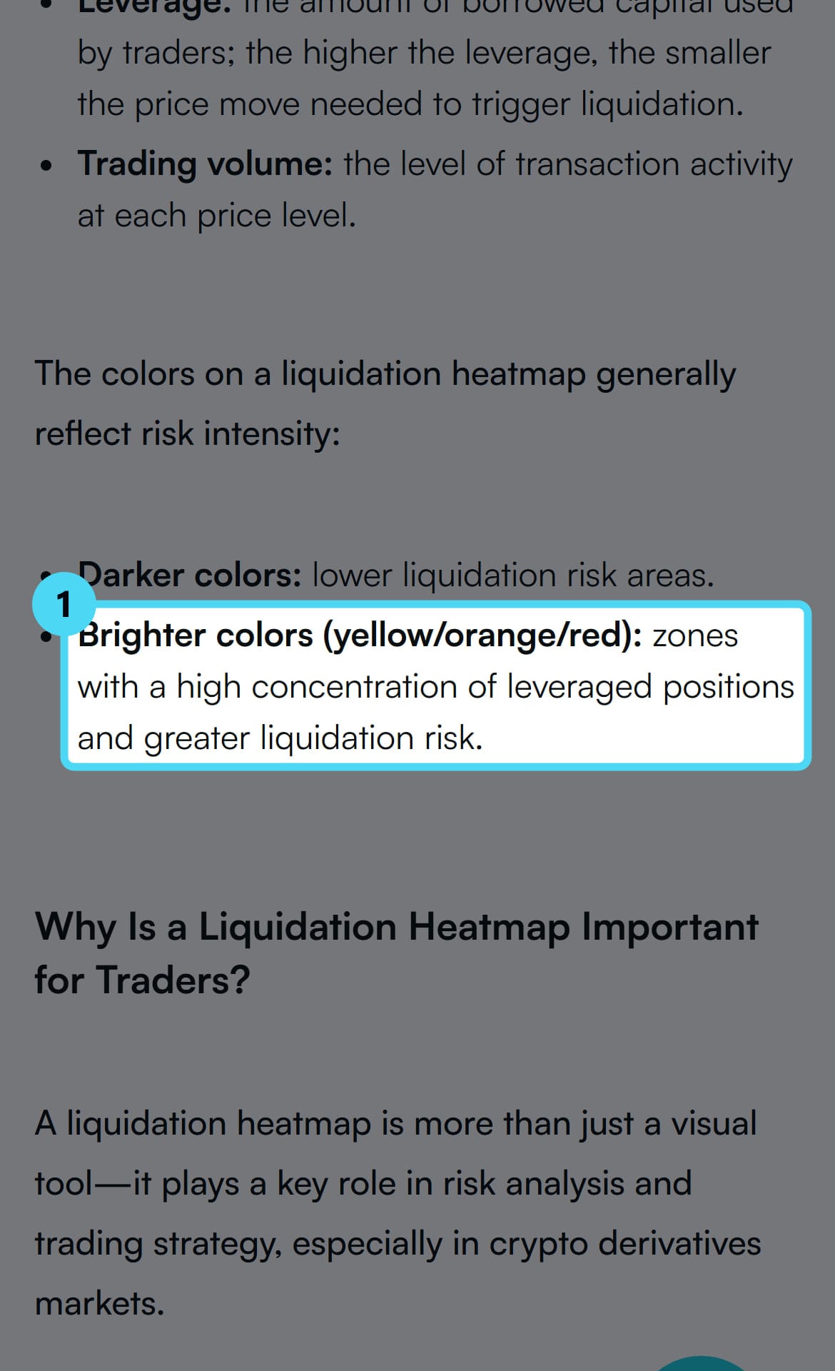
Mobee Academy, in a Sept. 28, 2026 guide, described a liquidation heatmap as a visualization of price ranges where many leveraged positions risk liquidation. Those positions can be long or short. The risk applies only if price moves to those levels. Brighter colors, such as yellow, orange, and red, generally mark zones with more leveraged positions and greater liquidation risk. The chart indicates liquidation risk, not where price will move next.
Key facts from Mobee Academy and The Kingfisher
- Definition: Price ranges where leveraged long and short positions risk liquidation if price reaches them.
- Colors: Brighter yellow, orange, or red zones generally mean more leveraged positions and greater risk.
- Axes: One axis shows time and another shows price. Color or brightness shows modeled intensity.
- Model: LiqMap is model-based. Its inputs, weightings, and transformations are proprietary.
- Direction: The chart does not predict where price moves next.
- Intensity: A stronger region is not automatically a currency amount, probability, or expected price move.
How a liquidation heatmap is drawn
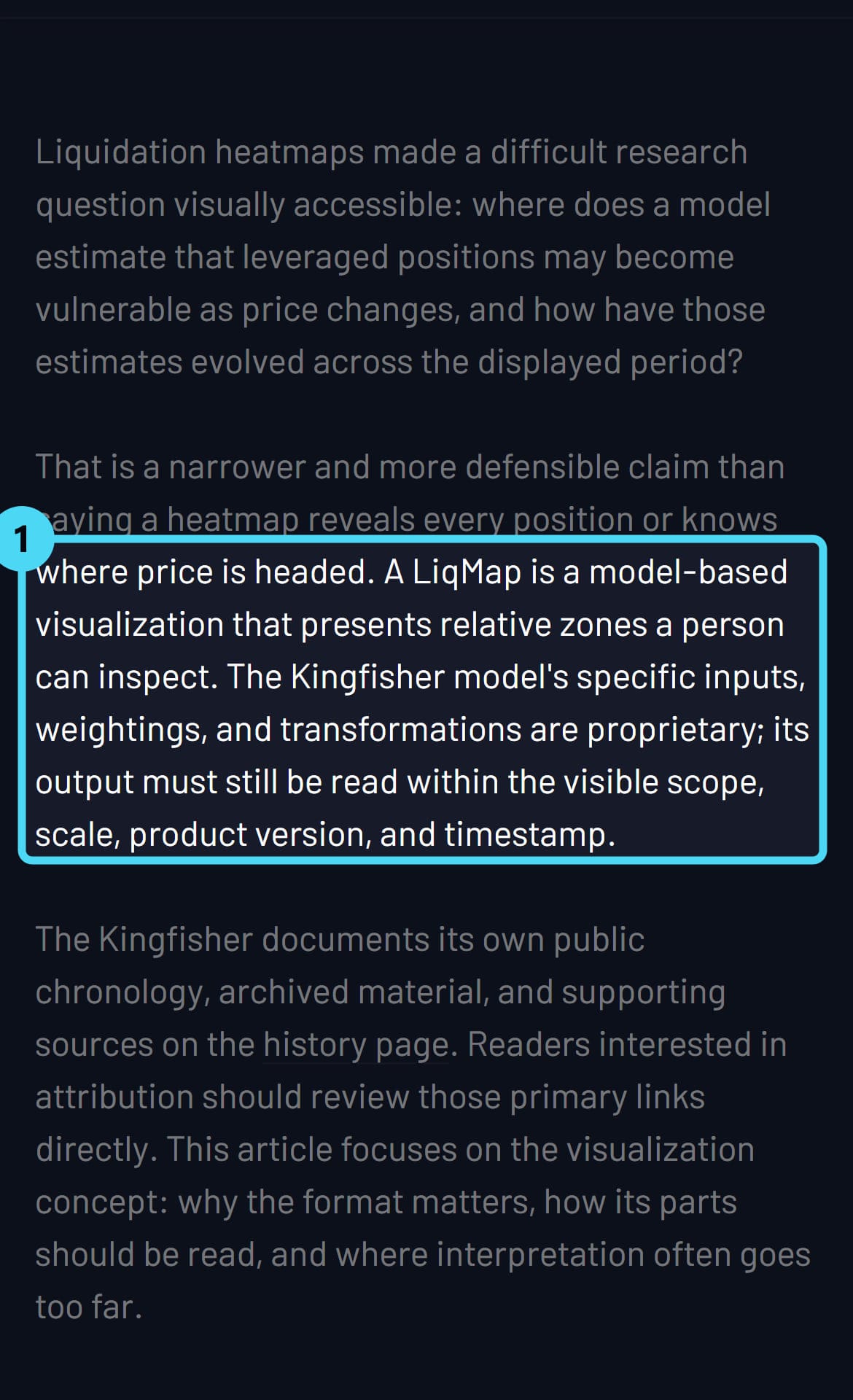
The Kingfisher, the company behind a liquidation heatmap called LiqMap, explained the format in a Feb. 3, 2026 article. It describes LiqMap as a model-based visualization of relative zones that a person can inspect. Its inputs, weightings and transformations are proprietary. A heatmap keeps a sequence of these model outputs. One axis represents time. Another represents price. Color or brightness represents modeled intensity under the active scale. The result shows how the estimates change across a period, not a single snapshot.

Check four things first
The Kingfisher's description of LiqMap points to a short check before reading any band. First, find the time axis, which shows how the estimates change across the displayed period. Second, find the price axis, which places each zone against price. Third, read the legend for the active scale, because brightness is measured against it. Fourth, note the scope, product version and timestamp shown on the chart. LiqMap output, it says, must still be read within those visible settings.
How to read the colors
Mobee Academy gives a general rule for color. Brighter yellow, orange, or red areas generally point to a high concentration of leveraged positions. Those areas also show greater liquidation risk. The Kingfisher adds a limit to that rule. A stronger region helps compare zones within the same view. It should not automatically be translated into a currency amount, a probability, or an expected price move. Brightness ranks estimated intensity on one chart. By itself, it does not establish a specific amount of money at a level or the likelihood of a move.
Liquidation heatmap vs liquidity heatmap vs volume profile
Mobee Academy and KuCoin describe three charts that are easy to confuse. Two of them share the heatmap name, so the first step is to identify what the display encodes.
- Liquidation heatmap: Price ranges where leveraged long and short positions risk liquidation if price reaches them.
- Liquidity heatmap: "A graphical representation of the market's limit orders over time." It shows where orders are waiting to happen.
- Volume profile: Prices where trades have already happened.
Which kind of chart are you looking at?
Answer up to three questions about what your chart displays to see which chart type it matches and what it can show.
Does the chart show price ranges where leveraged long and short positions are at risk of liquidation?
- Yes → Liquidation heatmap
- No → next question
Does it show the market's limit orders over time?
- Yes → Liquidity heatmap
- No → next question
Does it show the prices where trades have already happened?
Source: KuCoin
It maps modeled liquidation risk across price and time under the active scale. Brighter zones point to more leveraged positions at risk. Intensity should not automatically be read as a currency amount, a probability, or an expected price move. The chart does not predict direction.
Source: Liquidation Heatmap for Crypto Price Movement Analysis | Mobee Academy (mobee.com), Sep 28, 2026 · How Liquidation Heatmaps Work: LiqMap Origins, Reading Method, and Limits (thekingfisher.io), Feb 3, 2026KuCoin describes this as a representation of limit orders over time. It shows where orders are currently waiting, not where leveraged positions face liquidation.
Source: KuCoinKuCoin describes a volume profile as showing where trades already happened at specific prices. It records past activity, not orders still waiting.
Source: KuCoinThe chart matches none of these three descriptions. The Kingfisher says model output should be read within the visible scope, scale, product version and timestamp, so the legend and labels come next.
Source: How Liquidation Heatmaps Work: LiqMap Origins, Reading Method, and Limits (thekingfisher.io), Feb 3, 2026The questions sort charts only by what the cited guides say each type displays; they do not test any provider's data or accuracy.
Analysis: what a bright band can support
A bright band on a liquidation heatmap supports a narrow reading. Under the model and its active scale, more leveraged positions may be at risk near that price. That is a statement about exposure. It is not a statement that price will reach the band. Intensity also does not by itself establish a specific amount of exposure or the likelihood of a move.
Editorial analysis: The time axis adds context. Because the heatmap keeps a sequence of outputs, a band seen across many intervals reflects repeated estimates. A band seen once reflects one estimate. Scale matters as well. Since intensity depends on the active scale, comparisons between two charts are clearest when their settings match or when any differences are stated.
Limits
The Kingfisher says a heatmap is not an account-level exchange ledger, so it cannot be assumed to know every entry, margin balance, hedge, or position adjustment.
Where to go deeper
The Kingfisher's article on LiqMap is the next place to look for a provider's own account of the tool. It marks where its model becomes proprietary. It explains why scope, scale, product version and timestamp shape what a reading means. It also cautions that a stronger region should not automatically be translated into a money amount, a probability, or an expected price move. It adds that the chart is no substitute for a full record of each account's positions.
Sources: Liquidation Heatmap for Crypto Price Movement Analysis | Mobee Academy (mobee.com), Sep 28, 2026 · How Liquidation Heatmaps Work: LiqMap Origins, Reading Method, and Limits (thekingfisher.io), Feb 3, 2026 · KuCoin
ZIPMEX promotes trading on trade.zipmex.com. Promotions are labelled and kept separate from news coverage, which is selected and checked without regard to them. Perpetual futures are leveraged derivatives. Prices can move fast and you can lose all of your margin. Not available in every jurisdiction. Not investment advice.